Power BI is the (best) data visualization tool of Microsoft. But how to apply your color formatting to your visuals without changing it by hand for every visual separately, which is an option of course, but in case you will get a next category in your visual, you have to manually add this to your formatting. I run in to this challenge last week when a customer asked me if he could upload a definition to color each bar in his barchart based on the definition applied to the dimension on the X-axis. I decided to test a few things and write a blog about it.
We can apply our corporate identity to our reports and dashboards by using a theme file. With that you can set your corporate colors to your visuals by default, change the default font, font size and you can even apply settings to specific visuals. PowerBI.Tips made a great online theme generator which will help you by doing this. You can find this theme generator here. But what if you’ve uploaded your theme file, and you still want to apply different colors to your visuals based on your data and add a little bit more consistency? The theme file will add colors to your visuals based on the order they are in your theme file. Manually changing is an option, but with that you will break the relation between the visual and the theme file. Changes in your theme file won’t be applied automatically to this visual any longer. So, we can conclude that manually changing the colors is not a good option. But what to do…?
In tables we are used to apply conditional formatting based on data values. But since one of the latest updates we can make this color formatting way more advanced and apply it to almost every (standard) visual. This features is called advanced controls and you can find it in the format pane at the data colors tab. In general, there are two ways how you can apply these advanced controls to your data visualizations. The first is by writing a DAX code which includes your HEX color codes and a condition which will assign the right color to the right dimension in your visual. The second option is to add your HEX color codes to the data model in your dimensional table. Both options will be explained below.
Let’s set some context…
Before we jump in to the examples, it is good to set some context around the demo data. For all below examples I have used a very simple dataset. The dataset includes two tables, Cars and Transactions, which will represent the liters of fuel tanked by car. In this case the Car table is the dimension and the transactions is the fact table.
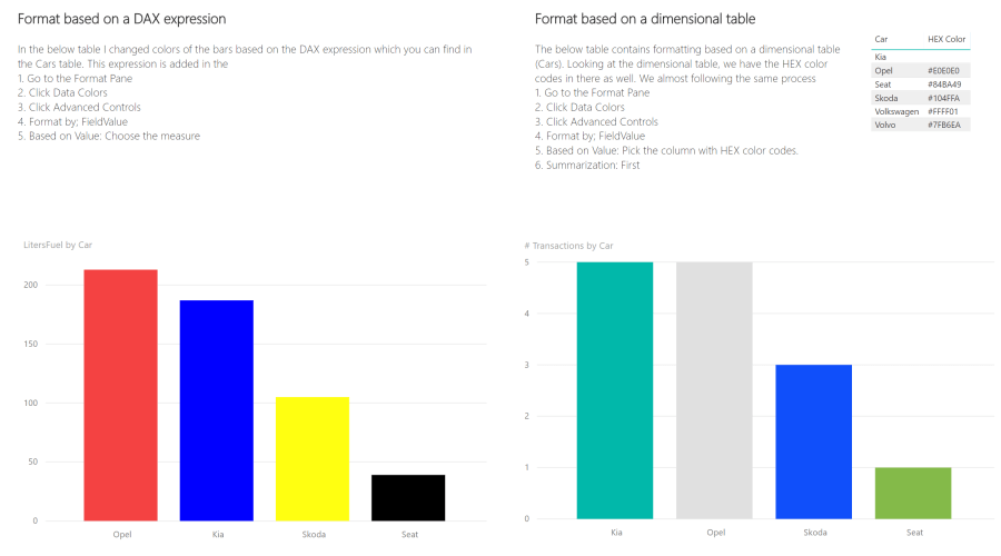
For this example, we will use a clustered column chart to show the number of transactions by car which will look like shown below. Next to that, I have created another clustered column chart to show the number of liters tanked by car. This will look like this, and of course with the same order by amount high-to-low.

But with that, we see that the order is different. So, the Kia has more transactions but still the total liters of fuel for the Opel is higher. Now, our consistency is broken. Of course you can always change the order to order by name so both visuals will be in the same order. Another option could be color usage, and guess what we’re going to do…
HEX colors in DAX
Adding your colors in DAX is released not that long ago. To do this, you have to create a new measure where you can set the colors for each value in your dimensional table manually. The advantage of adding this in a measure is that you only have to do this one. Afterwards you can re-use the created measure in multiple tables.
The DAX Code I created looks like this:
Colorformatting =
SWITCH(
    TRUE();
    SELECTEDVALUE(Cars[Car]) = "Opel" ; "#F44242";
    SELECTEDVALUE(Cars[Car]) = "Kia" ; "#0000FF";
    SELECTEDVALUE(Cars[Car]) = "Skoda"; "#FFFF11";
    "000000"
)
What this does, is checking for each value whether the condition is true for one of the specified cars and apply the defined color in the HEX code to it. At the latest you see the “000000” which is an alternative result. So if the conditions will not fit, it will get this color.
To use this measure for color formatting, take the following steps:
- Click your visual
- Go to the Format pane
- Click data colors
- Click advanced controls, now the conditional formatting window will pop-up.
- We are going to format the visual by Field Value
- Choose for measure we created.
After clicking OK you’re done, your visuals will be formatted in the way you created the measure.

The car brand Seat is not in the measure, and you see that it is formatted as defined as alternative result.
HEX colors in your dimensional table
Another option is to add the HEX color codes to your dimensional table, the same as you’re using to put on the axis of your visualization. In general, the process will be the same. At least you have to add a summarization to the column in the advanced controls. Follow the steps below to apply the color formatting based on the dimensional table:
- Click your visual
- Go to the Format pane
- Click data colors
- Click advanced controls, now the conditional formatting window will pop-up.
- We are going to format the visual by Field Value
- Choose the HEX Color column in your dimensional table.
- At summarization you can choose for First or Last, which one you pick doesn’t matter, since you’re using your dimensional table, each value is in it once, so there is always one value. First and last will result in the same.
Click OK and you’re done, your visuals will be formatted in the way as available in your dimensional table.

Looking at the dimensional table, we see that we don’t have a color available for the Kia. Still the Key got a color in the above visual. The alternative color is based on the default color of your theme file. Of course you can still manually change the default color in the formatting pane for each visual.
Remarks
Something that unfortunately will brake this way of color formatting, is adding a legend to your visual. As soon as you’ve added a legend this won’t work any longer. I hope Microsoft will improve it soon so that we can continue working with this type of color formatting.
The Power BI file used for this including examples can be downloaded here.
