
Let’s start this blog with a scenario. I think all of us, who are a (Power) BI professional, have been in this situation… Once you start a new project, you gain all the requirements for a newly to be created report, interview a representative group of users and you start building the report. After a few iterations BANG! Your report is live for hundreds or maybe even thousands of users around the world.
Because you put a lot of effort in it and you are proud of the result, you closely monitor the usage in the first weeks after the big bang. In the beginning the user statistics are booming and everybody is exploring the report, but after a while the numbers go down. But why? What is causing report visits to drop?
You decide to setup a few calls to investigate if the report matches the expectations, something is missing, or something needs to be added. It turns out, you as a data professional made a stunning report that is perfect from an analytical perspective but does not include as many fancy colorful visuals as the users want to see.
Let’s list a few things that you could start doing now;
- Ignore the fact that the content is less consumed than you hoped for. Your job is done and let’s move on to the next one. This may ruin the chances for a next assignment at this client.
- You allow the end-users to leverage your dataset in their own customized Power BI reports. But this requires some knowledge and a decent amount of time from your users to start building something themselves.
- Users start exporting data from the report visuals and build new Power BI reports based on manually exported data, which is not sustainable at all and you end up having different versions of the truth. (1)
- You start another iteration to build something based on the feedback you got. Now you might satisfy a few more users but end up having another group of users that is still not using it.
- Or… you allow users to customize the visuals according to their own wishes.
That last option is definitely an interesting one! But how? You don’t want to give hundreds of users workspace access and edit permissions. That will become one big mess! Let’s dive a bit deeper in this specific scenario!
(1) If manual exports as input for newly created reports is the case for you, please read one of my earlier blogposts about considering disable export to Excel.
Visual customization
As described above, there are tons of options to let your users fulfill their personal wishes when it comes to data visualization. All options have their pros and cons. But as of the April release of Power BI, there is a new option available that makes it much easier for users to customize the visualizations. This feature is officially released during the Microsoft Business Application Summit 2020.

This awesome feature allows every report consumer to customize the visuals within the Power BI service according to their wishes. I don’t want to repeat the official announcement where the feature is introduced, but below a short overview of what users can do;
- Change the type of visualization (get rid of the pie chart?)
- Swap measure or dimension used in the visual
- Add or remove the legend of a visual (if applicable)
- Add another measure to the visual for comparison (for example in a column chart)
- Change the default aggregation of a column from sum to average, min, max etc.
Prerequisites
Before they can start taking advantage of this new experience, there are a few prerequisites that you should take into account.
- Your tenant admin must allow you to use this feature (enabled by default)
- The preview feature needs to be enabled in Power BI desktop.
File > Options & Settings > Options > Preview Features > Personalize visuals - The feature should be specifically enabled for a report in the report settings.
File > Options & Settings > Options > Report Settings > Allow report readers to personalize visuals to suit their needs
That last one, is an important one. You don’t want this to be enabled by default where everyone starts creating fancy stuff based on your report, assuming that you build the report and visuals for a reason and with a purpose to tell them something.
Another important thing to know, all changes applied are personal. This will not affect your centrally managed report in any way. Neither the report will be copied, duplicated or a separate data silo will be created. It all happens within the report itself!
What considerations should be made?
As soon as you have the feature enabled, users will be able to start customizing every visual on the canvas. Yes! Really every visual! Even custom visuals are adjustable.
Relevance per visual
Now we know that this feature applies to every kind of visual, we should consider disabling it for some specific visuals. For example, disable it for slicers that have a static place on your report. You do not want user to mess-up your whole report lay-out.
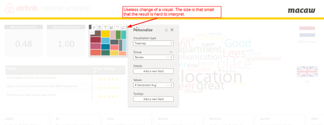
Another thing you should consider is that it might not be relevant for every visual. As said, every visual can be adjusted, but since users cannot change the size or location on the canvas of a visual. Therefor it might be useless to change certain visuals. As another example, adjusting the card visuals in below report is kind of useless. The cards are that small, that everything you put in that place will be unreadable.
If you want to disable this functionality for specific visuals, you can go into the visual settings in the format pane. In the visual header section, you can toggle the Personalize Visual option off.
Visual titles
Something else to keep in mind are visual titles. In above example you can see that I adjusted the visual for Average Sentiment. But in fact, the visual is now showing something completely different now.
Issues like this, only occur if the title is manually changed. The default titles generated by Power BI, consisting of measure and dimension, will change accordingly to the changes applied after customization. So, when users start adjusting the visuals, it can become harder to interpret the data. This gets risky if the user shares the report after the changes are applied. This can be prevented from happening
Enable for every report?
On another note, I doubt if you want to enable this for every report. Some corporate reports are simply not intended for customization and personalization. For example, your corporate annual figures. Therefor I think it is a good thing that this feature is disabled by default and have to be enabled on purpose in the report settings.
As a last point, I think we should see the added value for this new functionality mainly in providing a clean corporate look but enabling people to finetune the charts. Sell it as a “very strict template” with limited options for customization and governed by the report owner.

Pingback: Power BI visual customization – using perspectives – Data – Marc