You might have heard them saying it. One of the statements made by the Power BI team is that they want to become the PowerPoint for data. Every monthly release, they are bringing more cool features to Power BI, all based on user voice.
Last half year, the team already brought lots of useful improvements to the tool in terms user interface. With the April 2020 update, they take it a step further to get the user experience closer to the experience we all know from PowerPoint.
Recent improvements
Grouping and binding of visuals
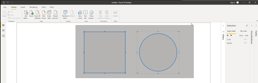
The new improvements are not only technically and data related, but also based on the user interface. A huge step forward, was the grouping and binding of visuals, similar to the PowerPoint experience (and other Office tools) that was released in August 2019. With that, it became a whole lot easier to group visuals together and move them all at the same time across the canvas.
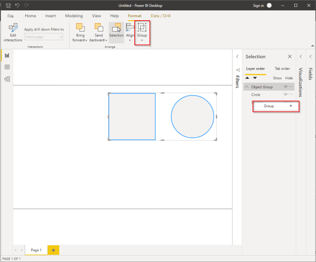
Grouping and binding can be done from either the Format section in the top ribbon, or the Selection Pane. Besides every object, you can rename groups via the Selection Pane.
New interface
Another great step is the new user interface of Power BI desktop. With that, the tool gets more similarity to Office tools like Word, PowerPoint and Excel, which have a similar user experience these days.
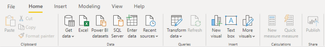
The new ribbon in Power BI Desktop is in preview for a very long time already. You can easily enable this yourself by going to File > Options and Settings > Options > Preview features. Here you can easily check the box for Updated ribbon. This Microsoft documentation nicely explains what is different in the new ribbon comparing to the previous interface.
The new ribbon is available as preview since the November 2019 and later. As Tessa Hurr already mentioned in the blog post, this is only the beginning. There are more changes coming to the ribbon in the following categories:
- Use more flexible and intuitive controls for features
- Add the black and dark grey Office themes to Power BI Desktop
- Improve accessibility to be on par with Office’s ribbon
Information based on Power BI blog, by Tessa Hurr – November 12th 2019.
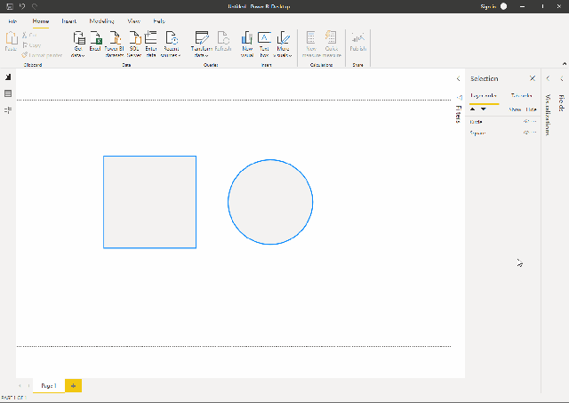
Lasso select objects
Imagine that you have a bunch of visuals on your canvas, maybe even overlapping. No matter if you grouped your visuals or not, it is always a big hassle to select the visuals you want to bulk format, group or any other change you want to apply. Control + click every visual or select them in the Selection Pane were the only options you had. Especially when you did not give every object an appropriate name, finding the right objects in the Selection Pane could have been challenging.
With the April 2020 Power BI desktop update, the team made a huge step forward. By allowing lasso select objects, we get a similar experience as we are used to in PowerPoint. Easily click and drag over the canvas to select all objects within that frame to be selected. This will make it a whole lot easier to multi select objects.
To my opinion, the name is a bit confusing cause it is not really a lasso, but a rectangle. Hopefully a future release will include functionality to select objects using a free format shape to better match the functionality with the name.
Nevertheless, I’m a huge fan of this new functionality! This was a major missing in Power BI until now. To my opinion, a great step forward in user experience and friendliness to report authors in Power BI Desktop!

This is certainly a nice feature. However, would would be far better is run-time lasso/select capability at runtime for plotted points on a chart. Competing products like Qlik have that – and it makes Qlik look more powerful.
Yes, there are third party visuals that offer that feature – however, they run slower than the native chart visuals. My concern here is that Power BI at runtime will become the “Winforms” of self-service BI.
LikeLike